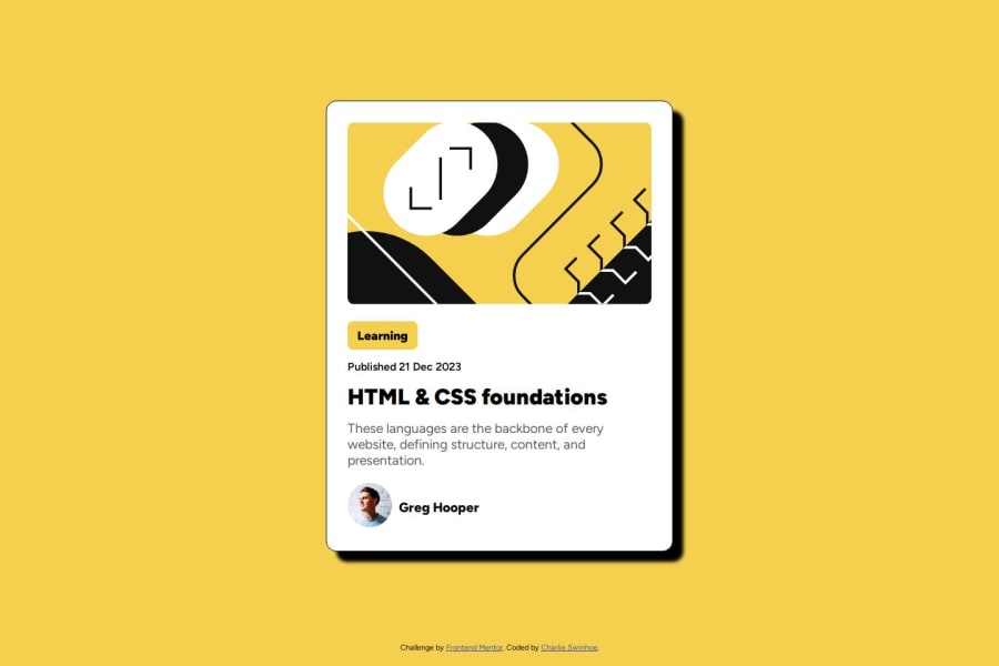
Design comparison
SolutionDesign
Solution retrospective
What are you most proud of, and what would you do differently next time?
I'm taking my time with the project more to try and get everything as close to the example as I can.
What challenges did you encounter, and how did you overcome them?Having some issue with height and width and how they react to different websites
What specific areas of your project would you like help with?Media queries are still something I'm struggling with a little bit
Community feedback
- @gilotinPosted 18 days ago
Having some issue with height and width and how they react to different websites:
- There are good videos created by Kevin Powell (He also has a free course for dynamic layuot, it realy helped me for some of the problems you are experincing)
- you can try to set max-width and work with percenteces with width.
Media queries are still something I'm struggling with a little bit:
- For media querries you can just type @media (min-width: <wanted width>){}, this is working for screens, faxes etc.
About Semantics
- I'm seeing you are using only divs and div.container could be section or aticle;
- p.learning could be header;
- Better to learn HTML semanticl will help you later in your jorney.
Happy coding
Marked as helpful1
Please log in to post a comment
Log in with GitHubJoin our Discord community
Join thousands of Frontend Mentor community members taking the challenges, sharing resources, helping each other, and chatting about all things front-end!
Join our Discord
