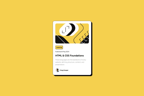
Submitted over 1 year agoA solution to the Blog preview card challenge
Blog Preview Page using Flexbox
@VivekMadhavan

Solution retrospective
What are you most proud of, and what would you do differently next time?
Learned the basics of Flexbox and used the Clamp function to resize fonts.
What challenges did you encounter, and how did you overcome them?One of the biggest challenge was effectively resizing fonts for different viewports without using media queries. Although I did the math to resize according to the requirements, I will need more practice to understand how the function works under the hood.
What specific areas of your project would you like help with?- Is there an option to resize the section (class = "blog-preview") without explicitly using pixel sizes? (Ex. 385px for width in css)
- How do I get the paragraph to continue onto the next line without using ?
- Does clamp work effectively across projects and can it be used for responsive design without using media queries?
Code
Loading...
Please log in to post a comment
Log in with GitHubCommunity feedback
No feedback yet. Be the first to give feedback on Vivek Madhavan's solution.
Join our Discord community
Join thousands of Frontend Mentor community members taking the challenges, sharing resources, helping each other, and chatting about all things front-end!
Join our Discord