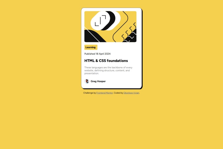
Design comparison
Solution retrospective
I'm most proud of the consistent progress I've made and how far I've come since I started. Each step forward has been a testament to my dedication and perseverance. However, looking back, I realize there are always areas for improvement. Next time, I aim to be more proactive in seeking feedback and incorporating it into my work. Additionally, I want to focus on refining my time management skills to ensure I'm making the most of every opportunity for growth
What challenges did you encounter, and how did you overcome them?One of the challenges I encountered was trying to implement the box-shadow effect, as I wasn't familiar with it initially. However, thanks to resources like W3Schools, I was able to learn about it and understand how to apply it effectively.
Another challenge I faced was accessing elements without specific IDs or class names. Through research and experimentation with GPT, I discovered techniques like descendant selectors in CSS, which allowed me to target and style elements based on their relationship to other elements in the HTML structure.
Overall, these challenges served as valuable learning opportunities, reinforcing the importance of resourcefulness and persistence in problem-solving. By leveraging online resources and exploring alternative approaches, I was able to overcome obstacles and continue making progress in my journey
What specific areas of your project would you like help with?As of now, nothing! However, if you notice any areas that need correction, I would appreciate your feedback.
Community feedback
- @Grego14Posted 7 months ago
Hello! 🎉 congratulations on completing the challenge! 🎉
I recommend removing the
margin: 8px
that the body element has by default, as it can cause problems in the design,Remove the margins you added to the .container element, as there are better ways to center it, one of them is to use 👉 Flexbox.
The
text-align: center
property on the .image element is unnecessary and has no effect.I don't recommend using
width: 70px
to make the Learning button take up less width since it is causing overflows, it is better that you do something like this:.background-yellow{ display: inline-block; margin-bottom: 0; }
inline-block
will make the element occupy the space it needs and not 100% of its parent andmargin-bottom
will remove the margin at the bottom since after applyinginline-block
the margin will no longer collapse with the margin of the element below.Do not use the strong tag to make the text of an element bolder, the strong tag is used to indicate that the text has great importance or urgency and should not be used to style elements.
I hope this helps! 😁
Marked as helpful0@okonksPosted 7 months agoWow thank you soo much @Grego14 . I am making those changes now and I have learnt alot I am just having a little issue with trying to center the .container div using Flexbox though, could you help with that too?
0@Grego14Posted 7 months ago@okonks When you use
display: flex
on an element it becomes a flex container and if it contains elements inside these become flex items.The way
align-items
andjustify-content
work can change depending on the value offlex-direction
, the default value of flex-direction is row, that meansjustify-content
will handle the main axis, andalign-items
will handle the cross axis.When we use the center value in
justify-content
this will cause the flex items to move in the center of the main axis of their parent. You may not notice its change if the flex container has a small width .When we use the center value in
align-items
this will cause the flex items to be centered on the cross axis of their parent element. If the parent container has a very small height it may not be noticeable.That's why I told you to use
min-height: 100%
in the body.You should also remove the margin you added to the .container element as it causes overflows.
When the value of
flex-direction
is column the axis are changed, cross axis takes the place of main axis and main axis takes the place of cross axis, and the same with thejustify-content
andalign-items
propertiesMarked as helpful0@okonksPosted 7 months agoThank you @Grego14 . I have made the necessary changes.
1
Please log in to post a comment
Log in with GitHubJoin our Discord community
Join thousands of Frontend Mentor community members taking the challenges, sharing resources, helping each other, and chatting about all things front-end!
Join our Discord