Design comparison
SolutionDesign
Please log in to post a comment
Log in with GitHubCommunity feedback
- @grgallosa
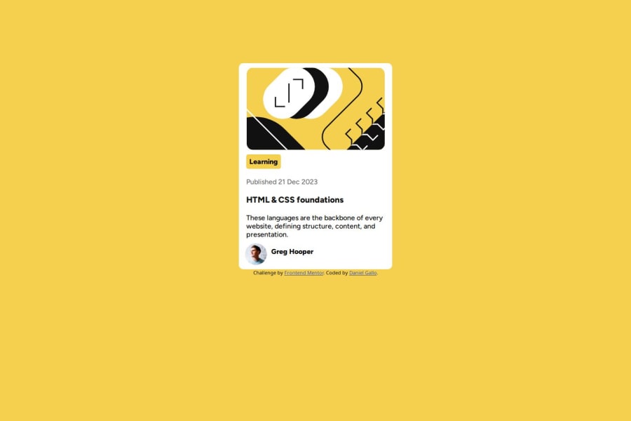
i think you need to add padding in your card to get that extra space and also author info need to be centered and needed a border and box shadow but overall looks great
Join our Discord community
Join thousands of Frontend Mentor community members taking the challenges, sharing resources, helping each other, and chatting about all things front-end!
Join our Discord
