Design comparison
Community feedback
- P@Islandstone89Posted 5 months ago
Good job!
A few things that could be improved:
HTML:
-
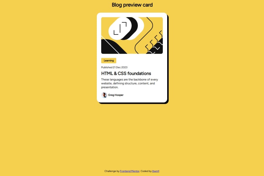
I see the top image more as decoration so I would have empty alt text:
alt="". -
Never have text in a
<div>alone. Change "Learning" to a<p>. -
I would wrap the date in a
<time>tag:<p class="publish-date">Published <time datetime="2023-12-21">21 Dec 2023</time></p>. -
As this is a blog card, the heading needs a link inside.
-
For the profile image, a better alt text would be "Headshot of Gary Hooper".
-
Wrap the footer text in a
<p>.
CSS:
-
Including a CSS Reset at the top is good practice.
-
Remove
box-sizing: border-boxon*, as it is already set on*,*::beforeand*::after. -
Remove
font-sizeonhtml, as16pxis the default value. -
For
line-height, you can also write1.5instead of150%. -
Remove
height: autoon the card and on "Learning", it is not needed. -
On "Learning" you can also use
width: fit-content.
Marked as helpful2P@ttwmfPosted 5 months ago@Islandstone89, thank you! ❤️ I've learned so much from your feedback.
1 -
- @velvet-jediPosted 5 months ago
I think the text color of the "These languages are..." is not matching also the vertically centered card, you missed it.
Marked as helpful0
Please log in to post a comment
Log in with GitHubJoin our Discord community
Join thousands of Frontend Mentor community members taking the challenges, sharing resources, helping each other, and chatting about all things front-end!
Join our Discord
