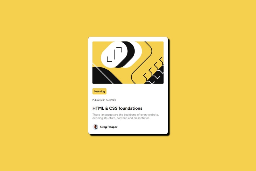
Design comparison
SolutionDesign
Solution retrospective
What are you most proud of, and what would you do differently next time?
The whole layout its good and i like it
What challenges did you encounter, and how did you overcome them?The card layout. overcame it with figma
What specific areas of your project would you like help with?Responsiveness
Community feedback
- P@ArthurPogPosted 10 months ago
Hey Alejandro! Great solution, I love it. I really like that nifty little animation you added to the drop shadow effect.
You've stated that you need help with responsiveness. What exactly do you need your little component there to do? To squeeze up, once the screen gets narrower?
0
Please log in to post a comment
Log in with GitHubJoin our Discord community
Join thousands of Frontend Mentor community members taking the challenges, sharing resources, helping each other, and chatting about all things front-end!
Join our Discord
