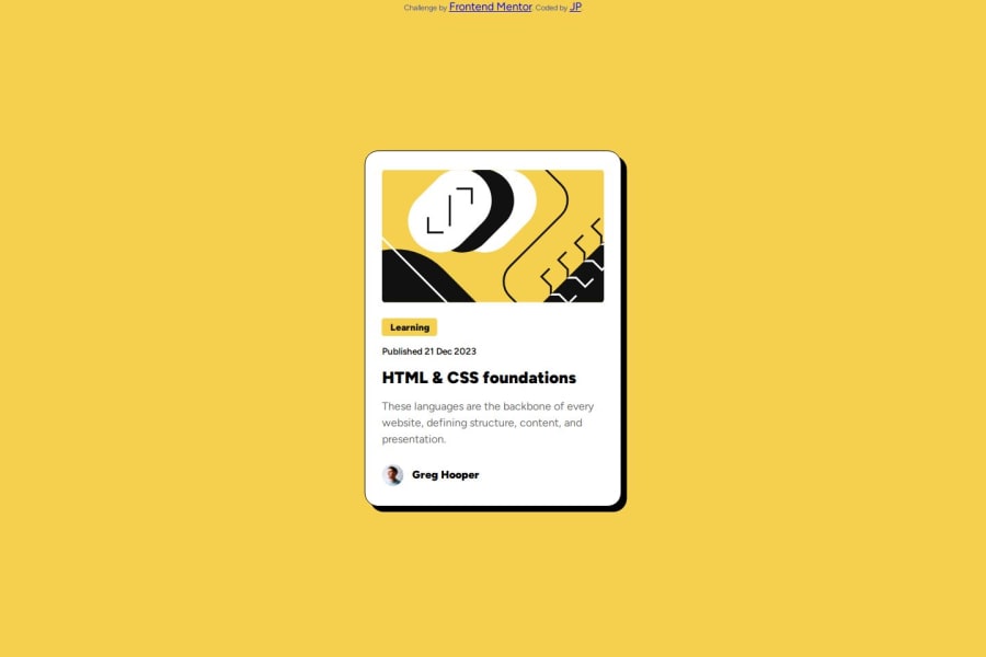
Design comparison
SolutionDesign
Community feedback
- @lazydroidePosted 6 months ago
Hi Mufth. Pretty good although using flex to center the card on the screen would have made your life simpler than using position absolute
Best regards.
0
Please log in to post a comment
Log in with GitHubJoin our Discord community
Join thousands of Frontend Mentor community members taking the challenges, sharing resources, helping each other, and chatting about all things front-end!
Join our Discord
