Design comparison
SolutionDesign
Solution retrospective
What specific areas of your project would you like help with?
All feedback welcome
Community feedback
- P@leonardoalmeida7Posted 5 months ago
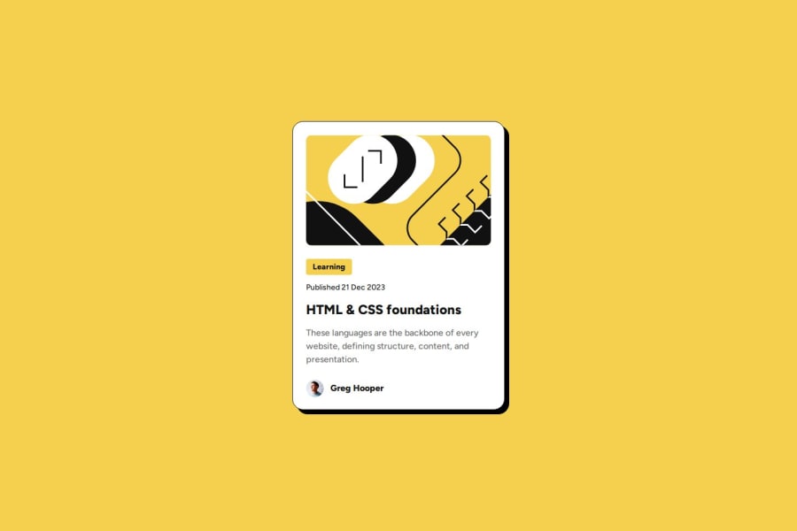
the code is semantic and not very confusing, I tested it on some screens, on the desktop version it looks good but on mobile it needed to adjust the element better, reducing it by 25%, so there would be space left on the sides of the screen.
Marked as helpful0
Please log in to post a comment
Log in with GitHubJoin our Discord community
Join thousands of Frontend Mentor community members taking the challenges, sharing resources, helping each other, and chatting about all things front-end!
Join our Discord
