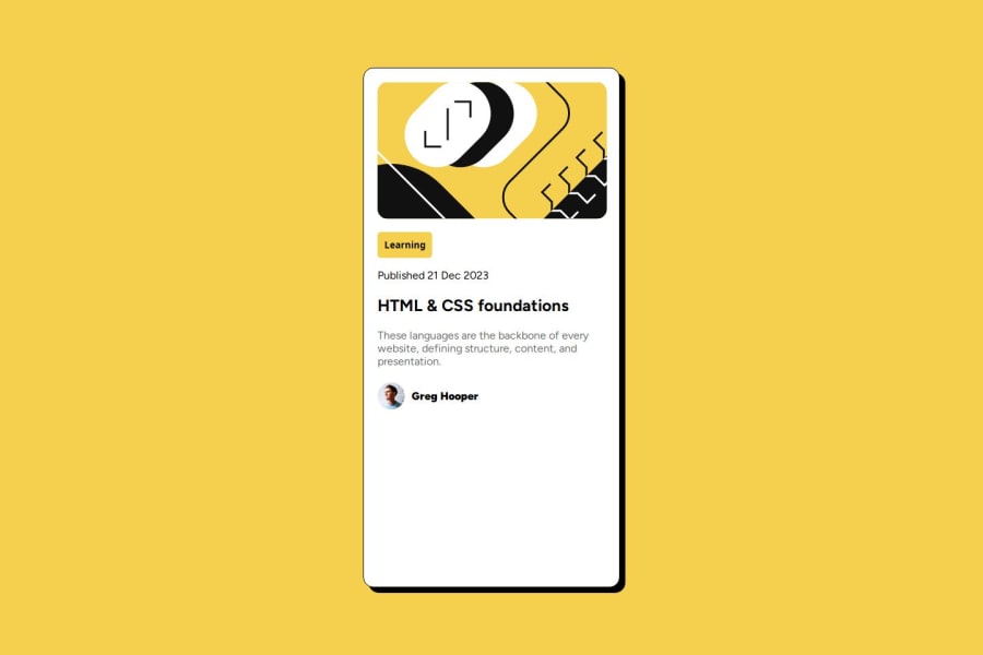
Design comparison
SolutionDesign
Solution retrospective
What are you most proud of, and what would you do differently next time?
For the first time, I understood the concept of box shadow and media queries, making my design responsive to different sizes
What challenges did you encounter, and how did you overcome them?The challenge I encountered was positioning the main container div. I was not sure of what to use whether to use flexbox or grid. But I ended up using flexbox
What specific areas of your project would you like help with?Responsive web design and animation
Community feedback
Please log in to post a comment
Log in with GitHubJoin our Discord community
Join thousands of Frontend Mentor community members taking the challenges, sharing resources, helping each other, and chatting about all things front-end!
Join our Discord
