

Design comparison

Solution retrospective
Using a package manager brings order to your project. You can install and use useful bundlers, formatters, linters, frameworks, and even other package managers. All this is recorded in your package.json, so you never lose track of your project. It is amazing!
What challenges did you encounter, and how did you overcome them?Trying to learn about all these technologies all at once is overwhelming. But still, my biggest challenge in this project is how to markup the content correctly so that screen reader users don't get lost.
What specific areas of your project would you like help with?If you see anything wrong with my code, especially with my HTML markup then please leave some feedback.
Community feedback
- @grace-snowPosted 3 months ago
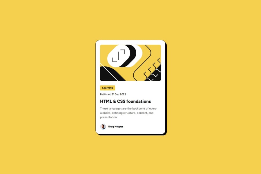
This is missing the one essential functional element in the html. How would users access this blog when there is no link included? That is a critical fix needed.
Once that's added, you will need to make the whole card clickable. Usually that's done with an absolutelg positioned pseudo element on the link.
The other thing I notice is that you've used a h1 for the heading. But consider how this component would be used on a site. This kind of card would never be used to serve the main heading on a page, so you know it shouldn't have a h1. Use a lower importance heading level like h2 instead.
The last recommendation is to use rem not px for the components max width. This is to ensure the layout scales correctly for all users including those who have a different text size setting. Currently using pixels could lead to large text being squished into a very narrow card.
Marked as helpful1@xianortPosted 2 months agoHello @grace-snow, I wanted to thank you for your feedback much earlier but something happened, sorry I'm so late, and thanks.
I fixed the card not having a link and I used
reminstead ofpxformax-width.I agree with you that this kind of component should have an
h2instead, but because it's the only component on the page and every page must have anh1I figured that this is a good approach.0@grace-snowPosted 2 months ago@xianort The issue is, this isn’t a web page; it’s a single component that you’re building to place into a web page. Once this component is used on a site, probably on a listing page with lots of blog cards, the h1 would then be inappropriate and break the heading hierarchy carefully constructed elsewhere.
This is an important learning when doing these challenges — to think of them in a component-based architecture.
It’s not actually true that “every page must have a h1” either. It’s a common misunderstanding. That is best practice guidance for full web pages. It’s not an accessibility or SEO issue to have no h1, more important that headings have been used appropriately.
I’ve written a blog post all about headings that you may find helpful: https://fedmentor.dev/posts/heading-order/.
Marked as helpful1

Please log in to post a comment
Log in with GitHubJoin our Discord community
Join thousands of Frontend Mentor community members taking the challenges, sharing resources, helping each other, and chatting about all things front-end!
Join our Discord