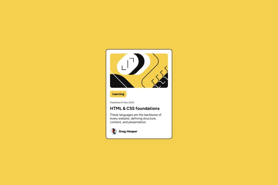
Design comparison
Solution retrospective
I'm proud about using translate & transition property. because it made elements looks more lively
Also, I just known about using CSS Selector in another CSS Selector because it maybe opens up my creativity but it seems to have some issues. Maybe there is more ways to do stuff like that
Aligning elements vertically is somehow difficult than horizontally because i tried to use align-items: center but its not working for me so i'm searching for any methods and i found out that i need another container element to wraps up the card itself and its now works perfectly fine
About the label name "Learning" (which i called info-status in this project) it stretches out by parent element which i set the property as display: flex and it uses all the width of the element and i asking people if there any solutions there and i got some tips from @gracesnow that i can use display: inline-block for a single child element in Flexbox and its worked
I don't know if is there any better way to do this or more accurate than this. I want to know if there any best practices or more tips & tricks about this
Please log in to post a comment
Log in with GitHubCommunity feedback
- @Aishi-Jain
Hello! I love the way you used the transitions to make the card look more lively! It definitely enhances the look of the preview card :) Although I would suggest your CSS code could be a lot more cleaner if you eliminated all the unnecessary line gaps in between sections. For eg, You could write it like this: .card-container { background-color: hsl(0, 0%, 100%); border: 2px solid hsl(0, 0%, 7%); border-radius: 12px; display: flex; flex-direction: column; width: 300px; padding: 20px; transition: box-shadow 0.12s, translate 0.12s; } The reason for this is it would be easier for anyone to read your code. The unnecessary gaps makes it look unclean. Also make sure you leave a line after every section, like this:
p, h1 {
  font-family: "Figtree", sans-serif;
  margin: 0;
}

a {
  text-decoration: none;
  color: black;
}
It separates every section and it will easier for you as well when you have to recheck the code.
Once again, great job!!
Marked as helpful
Join our Discord community
Join thousands of Frontend Mentor community members taking the challenges, sharing resources, helping each other, and chatting about all things front-end!
Join our Discord
