Submitted 7 months ago
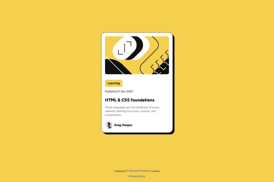
blog-preview-card's solution Accessibility Friendly
#accessibility#sass/scss
@Abo3bazez
Design comparison
SolutionDesign
Solution retrospective
What are you most proud of, and what would you do differently next time?
"This is my first time using rem and considering accessibility. I hope I used them correctly."
What challenges did you encounter, and how did you overcome them?nothing really
What specific areas of your project would you like help with?"The use of rem and accessibility I think I did not use them the right way."
Please log in to post a comment
Log in with GitHubCommunity feedback
- P@huyphan2210
Hi, @Abo3bazez,
I reviewed your solution and have a few thoughts:
- There aren’t strict rules when using
rem, and I'm not sure what you meant by "accessibility" in that context. - While it’s technically fine to use decimal values like
0.91remor1.3rem, I wouldn't recommend it for consistency. Sinceremis a relative unit based on the roothtmlfont size (which is usually1rem=16pxunless modified), I personally prefer to stick with rounded numbers. If I use decimals, I go for values like1.25rem,1.5rem, or1.75rem. If you feel that values like0.91remor1.3remwork better, then usingpxmight make more sense for precision. - Accessibility covers many areas. If you were referring to semantic HTML, you’ve done a good job, but there’s always room for improvement. You can draw inspiration from established design systems, like Google’s Material Design or Apple’s Human Interface Guidelines.
Hope this helps!
Marked as helpful - There aren’t strict rules when using
Join our Discord community
Join thousands of Frontend Mentor community members taking the challenges, sharing resources, helping each other, and chatting about all things front-end!
Join our Discord
