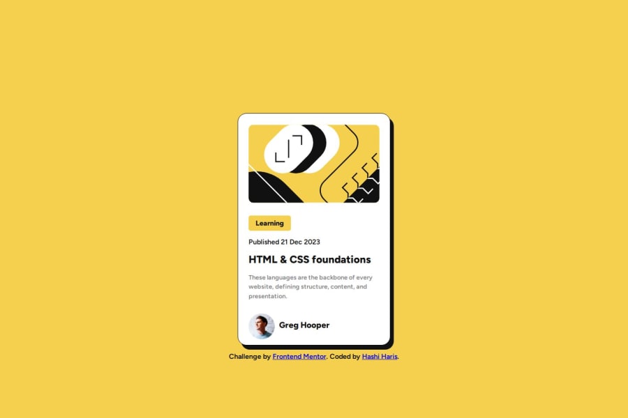
Blog Preview Card-Mobile First Responsive Solution using Flexbox
Design comparison
Solution retrospective
Hi all, Here's my solution for blog preview card. Please feel free to review my code and suggest for any potential improvements that I can do in my code.
Community feedback
- @MelvinAguilarPosted 11 months ago
Hello there 👋. Good job on completing the challenge !
I have some suggestions about your code that might interest you.
-
To make the alt attribute as useful and effective as possible, avoid using words such as "image", "photo", or "picture" as they are redundant because the image tag already conveys that information. Also the alt attribute should not contain underscores or hyphens. Instead, try to make the description as human-readable and understandable as possible.
- For a photo of a person, use their name as the alt text
If you want to learn more about the
altattribute, you can read this article. 📘.
-
You can use the following styles to center the element effectively using either of these two methods: For Grid:
body {
  min-height: 100vh;
  display: grid;
  place-items: center;
  /* Additional styles if needed */
}
For Flexbox:
body {
  min-height: 100vh;
  display: flex;
  flex-direction: column;
  justify-content: center;
  align-items: center;
  /* Additional styles if needed */
}
Later, you can remove this margin:
 .coursecard__container {
   /*margin: 0 auto;*/
   /*margin-top: var(--mrg-tp);*/
 }
I hope you find it useful! 😄 Above all, the solution you submitted is great!
Happy coding!
Marked as helpful0@hashiharisPosted 11 months ago@MelvinAguilar
Thank you for your valuable feedback and the tip as well :) . I will update my solution as you suggested.
1 -
Please log in to post a comment
Log in with GitHubJoin our Discord community
Join thousands of Frontend Mentor community members taking the challenges, sharing resources, helping each other, and chatting about all things front-end!
Join our Discord
