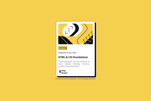
Design comparison
Solution retrospective
I really hope to get past this in the future
What challenges did you encounter, and how did you overcome them?I went through different challenges related to cross-browser compatibility. but I had to use the universal css to rectify it
Community feedback
- @zmora2622Posted 3 months ago
Try structuring the HTML code more and dividing the card into blocks such as card-img, card-body, card-footer, and wrapping the whole thing with a <main> tag.
Try to operate with max/min-width sizes, for better responsiveness.
I suggest you start by learning the css bem methodology, this will make it easier to create the HTML structure:
Also remember to indent your code - this will make it easier to read blocks of code and try to avoid inline styles in your HTML, it's all about CSS specificity:
You can set the font size using the font-size property. You don't have to rely only on the default sizes in the h1-h6 tags. However, as for headings, they are extremely important for accessibility, so they should not be used in the same way as the <p> paragraph.
I also don't see the fonts that were provided in the assets directory in the project. Adding fonts from file: using @font-face:
Marked as helpful1
Please log in to post a comment
Log in with GitHubJoin our Discord community
Join thousands of Frontend Mentor community members taking the challenges, sharing resources, helping each other, and chatting about all things front-end!
Join our Discord