

Design comparison

Solution retrospective
learning how to deal with background images and proud that I didn't see any video or tutorial to help me out
What challenges did you encounter, and how did you overcome them?how to CSS a photo in the SVG extension
What specific areas of your project would you like help with?Focus more on CSS and Train more
Please log in to post a comment
Log in with GitHubCommunity feedback
- P@Stroudy
Amazing job with this! You’re making fantastic progress. Here are some small tweaks that might take your solution to the next level…
-
Using a
<main>tag inside the<body>of your HTML is a best practice because it clearly identifies the main content of your page. This helps with accessibility and improves how search engines understand your content. -
These
<div>should really have semantic tags like headings (<h1> to <h6>) and paragraphs (<p>) convey structure and meaning to content, improving accessibility, SEO, and readability by helping search engines and screen readers interpret the content.
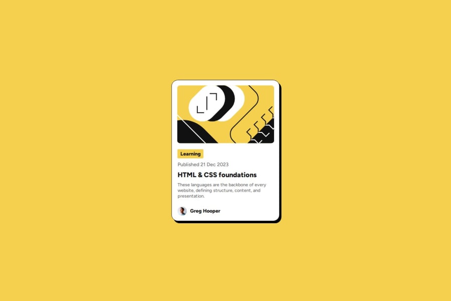
<div class="tag">Learning</div>-
Using a full modern CSS reset is beneficial because it removes default browser styling, creating a consistent starting point for your design across all browsers. It helps avoid unexpected layout issues and makes your styles more predictable, ensuring a uniform appearance on different devices and platforms, check out this site for a Full modern reset
-
Using
remoremunits in@mediaqueries is better thanpxbecause they are relative units that adapt to user settings, like their preferred font size. This makes your design more responsive and accessible, ensuring it looks good on different devices and respects user preferences. -
Using
position: absoluteis not always best practice because it removes elements from the normal document flow, making layouts harder to manage and potentially causing overlap or misalignment on different screen sizes. Instead, use flexible layout techniques like CSS Grid or Flexbox for more responsive and maintainable designs. -
For future project, You could download and host your own fonts using
@font-faceimproves website performance by reducing external requests, provides more control over font usage, ensures consistency across browsers, enhances offline availability, and avoids potential issues if third-party font services become unavailable. Place to get .woff2 fonts
You’re doing fantastic! I hope these tips help you as you continue your coding journey. Stay curious and keep experimenting—every challenge is an opportunity to learn. Have fun, and keep coding with confidence! 🌟
Marked as helpful -
- P@MikDra1
Well done, here are some things to review 😊:
-
Overusing div tags: Try using more semantic HTML elements like
<section>,<header>, and<article>. It’ll help with both accessibility and SEO. -
Neglecting responsive design: Make sure you're using media queries and following a mobile-first approach so your site looks great on all devices.
-
Inconsistent class naming: It’s easy to end up with a mess of class names. Consider using a system like BEM for better organization and scalability.
-
Using px for everything: Instead of
pxfor fonts and layouts, try using relative units likeremoremto make your design more adaptable to different screen sizes. -
Forgetting alt text on images: Don’t skip the
altattribute. It’s essential for accessibility and helps search engines understand what your images are. -
Poor use of Flexbox and Grid: Be careful not to mix Flexbox and Grid unnecessarily. Each has its strengths—use the right one based on the layout needs.
-
Not testing across browsers: Don’t forget to check how your site looks in different browsers like Firefox and Safari. Cross-browser testing is super important.
-
Using fixed heights for elements: Setting fixed heights can cause overflow issues. Use
min-heightor allow content to expand naturally to avoid problems. -
Not using responsive images: Be sure to use
srcsetor the<picture>element to optimize images for different devices. This improves performance, especially on mobile.
Hope you found this comment helpful 💗💗💗
Good job and keep going 😁😊😉
Marked as helpful -
- P@defenstration
Hi Omar,
Your blog preview card looks pretty good. There's only some minor differences in size and the typography on your date.
There are a few things in your code you may want to look at. In your HTML, it's a good idea to use the HTML tags to maintain semantic HTML. You have a div class img and used a background URL, which has it's place in dynamic designs but isn't great for screen readers. Similarly, I don't see a main tag, which is also an accessibility thing.
In your css, I like that you have the beginnings of a reset. After starting to use one myself, I have really liked how easy it made it. I might caution you against using the * selector for it, as it can do some funky stuff when your projects get bigger.
Another thing to keep in mind when looking at larger projects is the size of your selectors. There is quite a bit going on in your selectors, and that can get difficult to manage on more complex projects. A lot of the content I look at is moving toward smaller, modular classes. Take a look at bootstrap and tailwind and you will see how they use selectors.
Longer post than I meant it to be! You did a great job, stay awesome!
Marked as helpful


Join our Discord community
Join thousands of Frontend Mentor community members taking the challenges, sharing resources, helping each other, and chatting about all things front-end!
Join our Discord