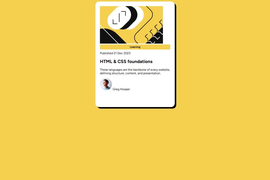
Design comparison
Solution retrospective
Fiddling with the CSS is both rewarding and frustrating. I'm still struggling with it, but looking at how other people have managed to style the project has helped me gain more of a grasp of the fundamentals of styling HTML elements.
What challenges did you encounter, and how did you overcome them?I am still struggling with the styling aspects of web page design. CSS Flexbox is a bit finicky, and I am having trouble grasping the concepts of centering and spacing things with Grid or Flexbox.
What specific areas of your project would you like help with?I need the most help with the styling aspects of this project. The CSS Flexbox model is still something that I have difficulty working with.
Please log in to post a comment
Log in with GitHubCommunity feedback
- @Grimm-N
Awesome work—you’re really putting in the effort, and it shows! 🌟 Keep going; you’re doing great!
Here are a few tips to polish your code even further:
-
Only use one
<main>element per page. Having more than one<main>can confuse screen readers and make it harder for assistive technologies to understand the main content of your page. -
Add classes to all elements—it keeps your code flexible and easy to style later on. Giving each element a unique class name helps you target and style each part of your layout precisely, especially as your project grows.
-
Try using
rem,em,%, orvhunits instead of pixels. These units adjust to different screen sizes, which makes your design more responsive and user-friendly. -
To center your card within the
body, try using flexbox:body { display: flex; justify-content: center; /* centers horizontally */ align-items: center; /* centers vertically */ height: 100vh; width: 100vw; }This centers the card both vertically and horizontally within the
bodycontainer. -
To prevent the card from sticking to the edges on smaller screens, try setting the card width to
90vwor90%:.card { width: 90vw; /* or 90% */ }This gives the card a little breathing room from the edges, making it look balanced at all screen sizes.
Marked as helpful -
- @DoDoingDone
Hey there! You're doing a great job- keep coding! I'm new as well, but I have one small pointer. I found using display: inline-block;
for the learning tag keeps it from spreading the full length of my card.
Good luck and hope to swap code answers soon!
Marked as helpful - @Symplyteeziy
I think you should improve drastically in using width and border. The padding on both side is not that okay.
Marked as helpful
Join our Discord community
Join thousands of Frontend Mentor community members taking the challenges, sharing resources, helping each other, and chatting about all things front-end!
Join our Discord
