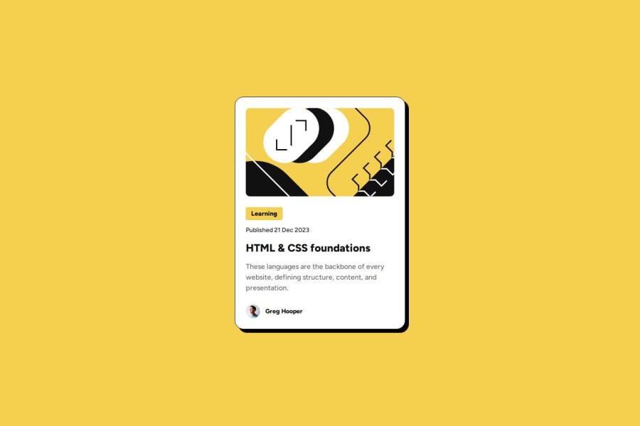
Design comparison
Solution retrospective
I am waiting feedback of the developer to rate my project
What challenges did you encounter, and how did you overcome them?sizing is the challenge
Community feedback
- @joaotfrodriguesPosted 8 months ago
Hi Abdirahim,
First of all, great job on your project! I loved the use of Tailwind CSS, it makes your design clean and efficient.
Your use of semantic HTML is excellent. However, instead of giving classes directly to the
<body>tag, I would suggest creating a<main>element for better structure and organization.In the
<article>, I would recommend creating a<header>for the image and a<footer>for the author details. This will improve the semantic structure of your content.One area that I think needs some change is the proportions. Since the challenge is FREE+, you can use the free Figma file to get the correct dimensions and ensure everything is well-proportioned.
Overall, you’re doing a fantastic job! Keep up the great work and consider these adjustments to further enhance your project.
Best regards,
João RodriguesMarked as helpful1
Please log in to post a comment
Log in with GitHubJoin our Discord community
Join thousands of Frontend Mentor community members taking the challenges, sharing resources, helping each other, and chatting about all things front-end!
Join our Discord
