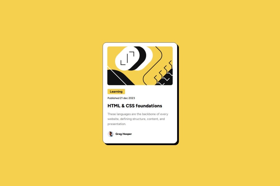
Design comparison
SolutionDesign
Solution retrospective
What are you most proud of, and what would you do differently next time?
Should have most of the design how it should be. Spend some time to understand the figma design.
What challenges did you encounter, and how did you overcome them?Deciding what to go for, for example going for a button for the learning text or making a div.
What specific areas of your project would you like help with?To see if my margins and paddings are correct. All my flex elements are done in the right way?
Please log in to post a comment
Log in with GitHubCommunity feedback
- @DevIanL
Achei muito interessante a sua solução.
Join our Discord community
Join thousands of Frontend Mentor community members taking the challenges, sharing resources, helping each other, and chatting about all things front-end!
Join our Discord
