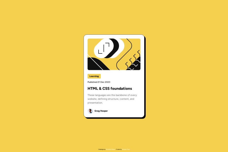
Design comparison
Solution retrospective
Hi there!
-
I created a list of buttons for the implied filtering system. See-- .topic-tags-list, .topic-tag, and .topic-tag-btn. I thought that if tags can be added and subtracted, a list would be preferable here. I also used buttons for in-page filtering, but I suppose anchors could be used if the filtering system is not in-page. I would like to know if this is semantically correct, and if my reasoning is sound?
-
I had added a "line-height: 150%" to the body style, thinking it would apply to all text. This property did not affect the headings or button. I had to go back and include this property in their classes as well. Why is this?
Thank you!!
Please log in to post a comment
Log in with GitHubCommunity feedback
No feedback yet. Be the first to give feedback on MELT's solution.
Join our Discord community
Join thousands of Frontend Mentor community members taking the challenges, sharing resources, helping each other, and chatting about all things front-end!
Join our Discord
