Design comparison
Community feedback
- P@MattJM1007Posted 12 months ago
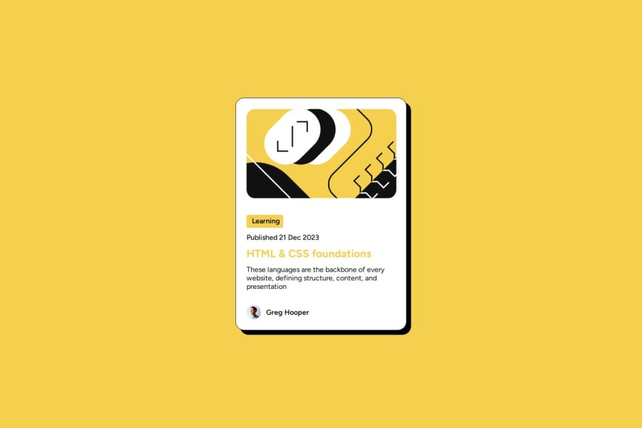
Great work on completing this! The layout of everything looks great.
A couple small details, the title of the blog should be black and the hover state is yellow, it looks like you just have it set to the yellow color.
For the description text, it should be the light gray. I also found out that you can adjust the line height of this to better match the design. I used
line-height: 1.5;in my solution.I'll also pass on feedback I received about html, which is to use more specific tags, like
<main>,<article>,<footer>, etc. This helps with accessibility from my understanding. So for example you could replace the '<div class="card">' with '<main>' in your code.Great job!!
0
Please log in to post a comment
Log in with GitHubJoin our Discord community
Join thousands of Frontend Mentor community members taking the challenges, sharing resources, helping each other, and chatting about all things front-end!
Join our Discord
