Submitted 11 months ago
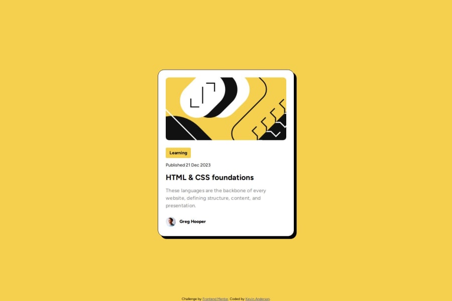
Blog Preview Card. Working through Learning Path
@kevincanderson
Design comparison
SolutionDesign
Solution retrospective
What are you most proud of, and what would you do differently next time?
Getting it done. Putting the time in.
What challenges did you encounter, and how did you overcome them?Getting the font and sizing right between the devices.
What specific areas of your project would you like help with?Fixing figma font issues. Learning what html elements to put margin on if there is multiple in a line/column.
Community feedback
Please log in to post a comment
Log in with GitHubJoin our Discord community
Join thousands of Frontend Mentor community members taking the challenges, sharing resources, helping each other, and chatting about all things front-end!
Join our Discord
