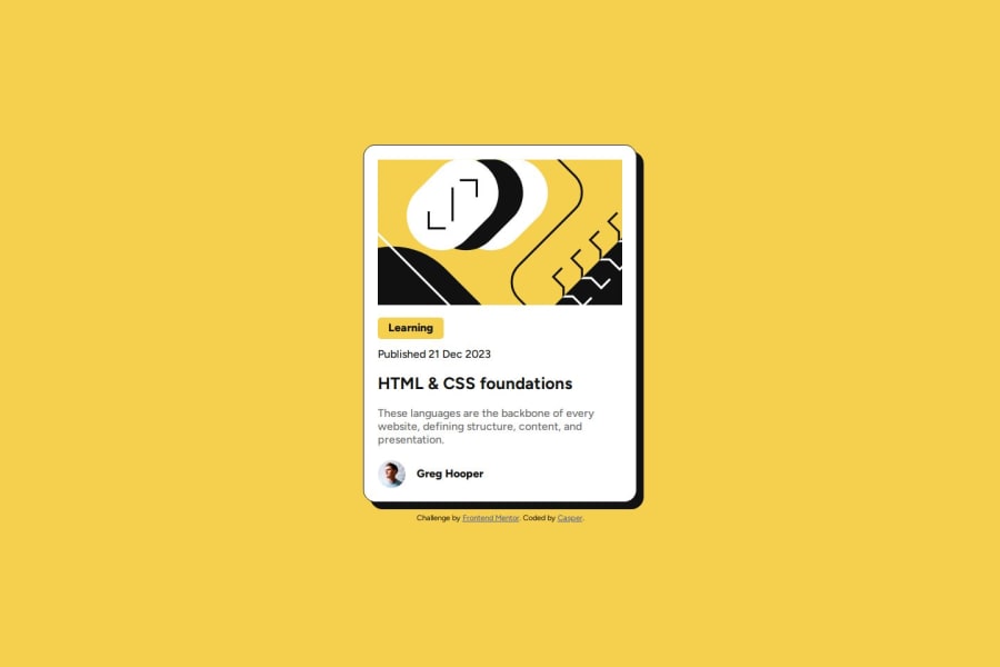
Design comparison
SolutionDesign
Community feedback
- @MohammedOnGitPosted 2 months ago
Hello casper pelsma!
Your HTML structure looks solid for a blog preview card. However, I noticed a few points that might improve your design:
- Semantic HTML: Wrap the h1 in a header tag, and the article content in an article tag. This will improve semantic structure.
- Heading Hierarchy: It's best practice to ensure a clear hierarchy between headings. Since you have an h2 before the h1 for "HTML & CSS foundations", consider reordering them or adjusting the levels.
- <span> around <h2>: Wrapping an h2 in a span is unnecessary, as headings are block-level elements by default. You can style h2 directly without needing the extra wrapper.
- Alt text: For the profile image, "Profile picture" could be improved to be more descriptive, such as "Greg Hooper's profile picture".
These updates can improve the accessibility and performance of your project. You did great. *** Keep it up!***
0 - @StroudyPosted 2 months ago
@Casper-pel, I’d like to provide some feedback. In past challenges, I noticed you haven't engaged or responded when solutions were submitted. Networking and actively engaging with the community are essential, and I highly encourage you to embrace these practices. They can greatly enhance collaboration and growth.
0
Please log in to post a comment
Log in with GitHubJoin our Discord community
Join thousands of Frontend Mentor community members taking the challenges, sharing resources, helping each other, and chatting about all things front-end!
Join our Discord
