


Marcos Travaglini• 4,920
@Blackpachamame
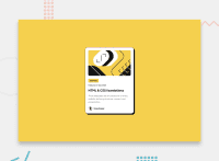
Posted
Hey Rowan! this looks really good 😎
I just have some suggestions:
- I recommend doing a small reset to the styles that come by default in the browsers. To do this, you can apply a couple of properties to the universal selector
*, with this you will make your site look the same in all browsers:
* {
    margin: 0;
    box-sizing: border-box;
}
- I leave you the task of researching the
reset CSSand thebox-sizing: border-box - Do not use
height: 100vhinstead usemin-height: 100vhthis will prevent the content from being cut off on certain occasions - To center the content you can apply
flexboxto thebody:
body {
    min-height: 100vh;
    background-color: hsl(47, 88%, 63%);
    font-family: 'Figtree', sans-serif;
    font-size: 16px;
    line-height: 150%;
    display: flex;
    flex-direction: column;
    justify-content: center;
    align-items: center;
    gap: 20px;
}
- With these changes your
divwith classmain-containerwill no longer be necessary, you can delete it and leave thedivwith classpreview-card
Marked as helpful
2

