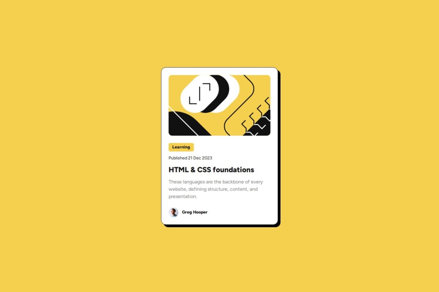
Blog Preview Card with tailwindcss and @font-face
Design comparison
Solution retrospective
This time I used prettier with the tailwind plugin to format the code, so all the tailwind classes are sorted properly.
Also I used the screenshots from the design to implement it first, it was quite cumbersome to get all the measurements (font-sizes, heights and colors) because the image was antialiased. Then I used the figma to correct the initial values.
Also I was distracting myself during this challenge by watching youtoube videos, I should stop that :D
What challenges did you encounter, and how did you overcome them?Somehow the Figma download did not work so I used the screenshots to start the challenge but it was very cumbersome. Finally I got the Figma download to work by copying the URL and use wget from another host.
Any feedback on tailwind specific issues are appreciated, other feedback is appreciated as well.
Community feedback
Please log in to post a comment
Log in with GitHubJoin our Discord community
Join thousands of Frontend Mentor community members taking the challenges, sharing resources, helping each other, and chatting about all things front-end!
Join our Discord
