Design comparison
Solution retrospective
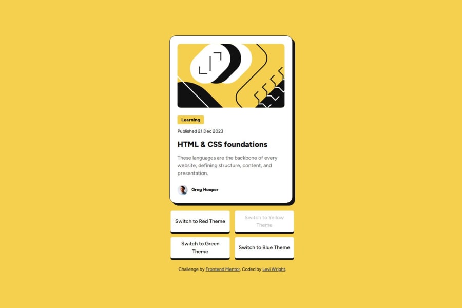
I am proud of the card being pretty much indistinguishable from the original design. Also, I took full advantage of SCSS this time around, with a couple of examples of that below:
@mixin selected-button-colors($bg-c, $c: "gray-950") {
    #theme_switcher_#{$bg-c} {
        &:hover:not([disabled]), &:active, &:focus {
            background-color: var(--#{$bg-c});
            color: var(--#{$c});
        }
    }
}
@for $i from 1 through 3 {
        &:nth-child(#{1 + $i}) {
            top: -100% * $i;
        }
    }
This wasn't part of the challenge requirements, but figuring out how I would apply a transition to the blog image took some time. I would've tried giving the relevant path in the SVG an ID and using said ID to change the fill color via CSS variables, but I didn't want to place the SVG within the index.html file itself, because I didn't know how to apply alt text to an SVG element. I think the solution I implemented has lots of room for improvement, as it involves four different images being rendered at the same time and the opacity of them being turned from 0 to 1 (and vice versa) through JavaScript, but it does do what it's supposed to at least.
What specific areas of your project would you like help with?I would like to know what a better way of styling the blog image would be, and if and how alt text can be applied to SVG elements.
Please log in to post a comment
Log in with GitHubCommunity feedback
No feedback yet. Be the first to give feedback on Levi's solution.
Join our Discord community
Join thousands of Frontend Mentor community members taking the challenges, sharing resources, helping each other, and chatting about all things front-end!
Join our Discord
