

Design comparison

Community feedback
- @GeorgePapalazaridisPosted about 2 months ago
Hi George,
Amazing job on completing the Blog Preview Card Component Challenge! I can see the effort and thought you’ve put into this project, and it really shows. Here's some feedback to help you fine-tune your work even further:
What I Loved:
-
File Organization:
- Your file structure is clean and well-organized. Using SCSS partials for globals and reusables demonstrates great foresight—it shows you're thinking about scalability and maintainability.
-
Responsive Design:
- The responsiveness works beautifully! The way the layout adjusts at different breakpoints feels smooth, and you’ve handled font scaling and padding changes thoughtfully.
- I particularly like how you’ve maintained a consistent design from mobile to desktop without losing balance.
-
Challenge Requirements:
- You’ve implemented the challenge prerequisites, like using the Figtree font,
box-shadow, andborder-radius, in a way that feels seamless and enhances the design. Even though these were requirements, you executed them with care, making the card visually appealing.
- You’ve implemented the challenge prerequisites, like using the Figtree font,
Suggestions for Improvement:
-
Accessibility:
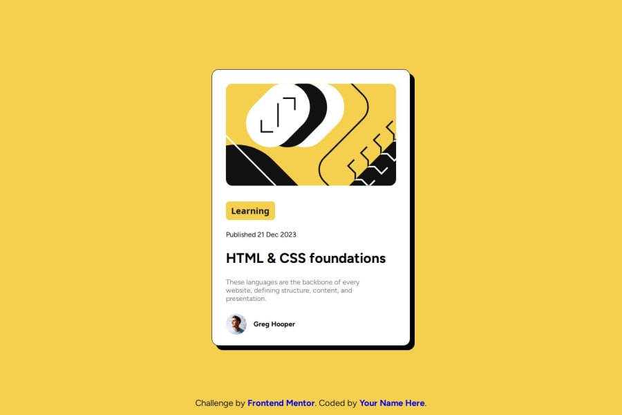
- While the project is mostly accessible, the
altattributes on your images could be more descriptive. For example:
This small tweak ensures better support for screen readers and improves inclusivity.<img class="header-container_img" src="./assets/images/illustration-article.svg" alt="Illustration about HTML and CSS foundations" />
- While the project is mostly accessible, the
-
Semantic HTML:
-
The
divwrapping the entire blog card (blog-preview-card) could be replaced with a more meaningful semantic tag like<article>or<main>to better reflect the content’s purpose. For example:<main class="blog-preview-card"> ... </main>Using semantic tags helps screen readers and improves overall code readability.
-
Additionally, using a
<button>or<span>instead of adivfor the "Learning" section would enhance semantics. If this element is interactive, a<button>would be more appropriate.
-
-
CSS Optimization:
- Switching from fixed units like
pxto relative units likeremoremcould improve scalability. For example:
This will make your design even more adaptable to user settings.font-size: 1.25rem; /* instead of font-size: 20px */
- Switching from fixed units like
-
Footer Styling:
- Currently, the
footer-containeris positioned absolutely at the bottom, which might cause layout issues if the content grows taller than expected. You could try usingflexboxon the parent container to create a more flexible layout. Something like this:.blog-preview-card { display: flex; flex-direction: column; min-height: 100vh; justify-content: space-between; }
- Currently, the
-
Mobile-first Approach:
- While your breakpoints are solid, starting with mobile-first styles and adding larger breakpoints as you go would make your CSS more efficient and easier to manage.
Final Thoughts:
You’ve done an outstanding job! The design is clean, responsive, and visually appealing. The SCSS structure makes it easy to maintain and extend, and your work on responsiveness is commendable.
With just a few tweaks—like enhancing accessibility, improving semantic structure, and refining footer behavior—you’ll have a truly polished solution. Keep up the great work, and I’m excited to see more of your projects in the future!
Best regards,
GP0 -

Please log in to post a comment
Log in with GitHub
Join our Discord community
Join thousands of Frontend Mentor community members taking the challenges, sharing resources, helping each other, and chatting about all things front-end!
Join our Discord