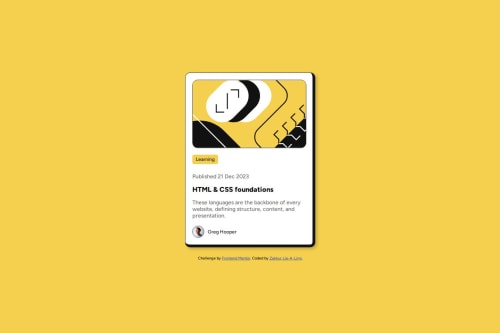
Blog preview card with responsive design and custom borders

Solution retrospective
I’m proud of overcoming my tendency to overthink the code. The border styling, i couldn't immediately figure out how the border was designed. And solving it quickly using border-width and adjusting the borders here instead of trying to put new borders on top off the existing one already of the card (was doing this first). In the past, I’d overthink code and take much longer, so this felt like a big step forward.
What challenges did you encounter, and how did you overcome them?One major challenge was getting the border styling right. Initially, I had a uniform thin border on all sides of the card, but the original design required thicker borders on the right and bottom. This threw off the visual balance, and I struggled with how to apply this style to the card, i was overthinking it and trying to add borders by creating a different border that is only on the right and bottom on top of the card and existing border itself. I overcame this by using the border-width property to specify different thicknesses for each side (1px 8px 8px 1px) and added box-sizing: border-box to ensure the card’s dimensions stayed consistent.
Another challenge was ensuring the card remained responsive across all screen sizes, especially below 375px. I used percentage-based widths (width: 90%) with a max-width of 375px, which worked well, but I had to test extensively to ensure the padding and content didn’t overflow on smaller screens.
What specific areas of your project would you like help with?Nothing at the moment.
Please log in to post a comment
Log in with GitHubCommunity feedback
No feedback yet. Be the first to give feedback on Zakkur Lie-A-Ling's solution.
Join our Discord community
Join thousands of Frontend Mentor community members taking the challenges, sharing resources, helping each other, and chatting about all things front-end!
Join our Discord