Submitted about 1 month ago
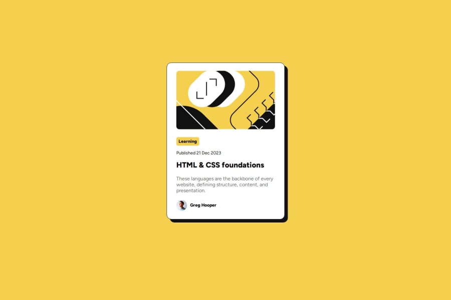
Blog preview card with responsive CSS
#accessibility

@jamurai77

Design comparison
SolutionDesign

Solution retrospective
What are you most proud of, and what would you do differently next time?
More practice with HTML and CSS. Feel like I may have used "id" when I should have used "class" more. Not sure I was very successful with implementing the responsiveness correctly...
What specific areas of your project would you like help with?Just trying to figure out how to write using best practices. Feel like I may not be writing the best code even though the result looks okay.
Community feedback
- @BlackpachamamePosted about 1 month ago
Greetings! you have done a great job 😎
📌 Some suggestions
- Try to avoid using
idto style your elements, it is best to do it through classes - I recommend doing a small
resetto the styles that come by default in the browsers. To do this, you can apply a couple of properties to the universal selector*, with this you will make your site look the same in all browsers - I leave you the task of researching the
reset CSSand thebox-sizing: border-box - If you didn't apply the reset, you can add
margin: 0to yourbody, this will remove annoying scrolling on large screens. If you want to maintain separation on very small screens, you can apply themarginagain using media querys - Apply
max-width: 100%to yourimgso that it occupies the correct width within the container
Marked as helpful0 - Try to avoid using

Please log in to post a comment
Log in with GitHub
Join our Discord community
Join thousands of Frontend Mentor community members taking the challenges, sharing resources, helping each other, and chatting about all things front-end!
Join our Discord