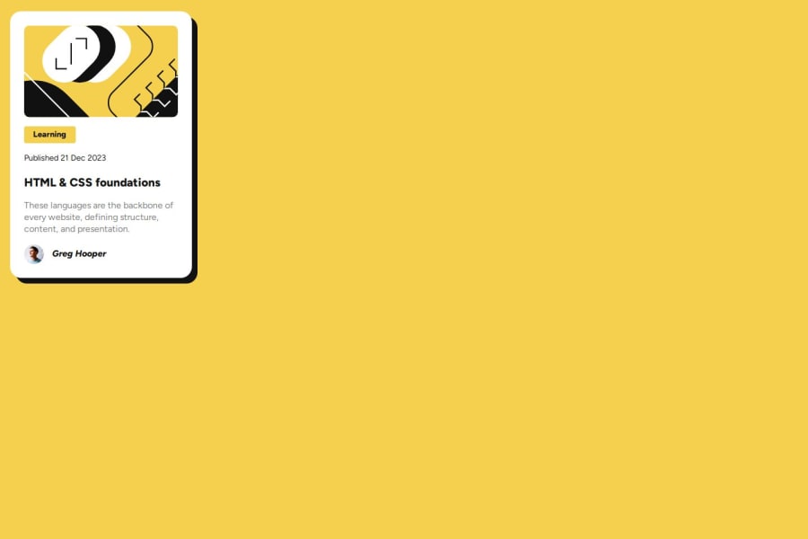
Design comparison
Solution retrospective
I generally don't like posting simple things like this online, but I thought I'd give it a try, so this! This is actually my second attempt at the project, so most of the things I would have fixed I did. I think my code could be way more organized and I should probably deal with fonts differently (maybe font classes...?).
What challenges did you encounter, and how did you overcome them?The hardest part was certainly alignment. The games flexbox froggy and grid garden helped so much in simplifying things and helping me understand.
What specific areas of your project would you like help with?How should I structure my code in CSS and HTML? It all feels sort of chaotic. If I want multiple cards in HTML, do I have to repeat all that code, or can I create some sort of component and use that multiple times?
Community feedback
Please log in to post a comment
Log in with GitHubJoin our Discord community
Join thousands of Frontend Mentor community members taking the challenges, sharing resources, helping each other, and chatting about all things front-end!
Join our Discord
