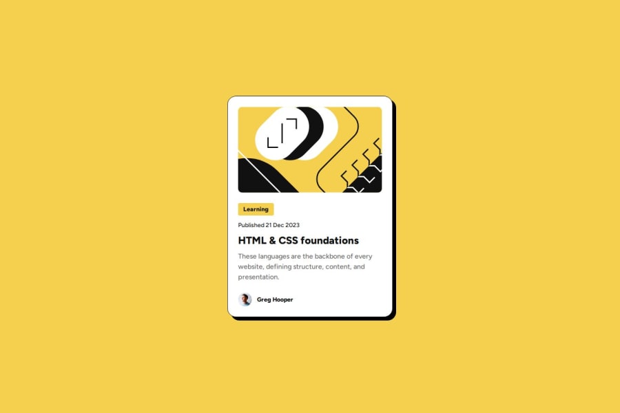
Blog preview card with plain HTML & CSS
Design comparison
Solution retrospective
I figured out how to tweak the font size between mobile and desktop without media/container queries. Not sure what the intended solution was
What challenges did you encounter, and how did you overcome them?I need to stop trying to make my solution perfectly match the Figma design.
Community feedback
- @StroudyPosted about 2 months ago
Amazing job with this! You’re making fantastic progress. Here are some small tweaks that might take your solution to the next level…
-
Using a
<main>
tag inside the<body>
of your HTML is a best practice because it clearly identifies the main content of your page. This helps with accessibility and improves how search engines understand your content. -
These
<div>
should really have semantic tags like headings (<h1> to <h6>
) and paragraphs (<p>
) convey structure and meaning to content, improving accessibility, SEO, and readability by helping search engines and screen readers interpret the content.<div class="tag text-small-bold round-1 bg-yellow-500">Learning</div>
-
While
px
is useful for precise, fixed sizing, such asborder-width
,border-radius
,inline-padding
, and<img>
sizes, it has limitations. Pixels don't scale well with user settings or adapt to different devices, which can negatively impact accessibility and responsiveness. For example, usingpx
for font sizes can make text harder to read on some screens, Check this article why font-size must NEVER be in pixels. In contrast, relative units likerem
andem
adjust based on the user’s preferences and device settings, making your design more flexible and accessible. Usepx
where exact sizing is needed, but prefer relative units for scalable layouts. If you want a deeper explanation watch this video by Kevin Powell CSS em and rem explained. Another great resource I found useful is this px to rem converter based on the default font-size of 16 pixel. -
For future project, You could download and host your own fonts using
@font-face
improves website performance by reducing external requests, provides more control over font usage, ensures consistency across browsers, enhances offline availability, and avoids potential issues if third-party font services become unavailable. Place to get .woff2 fonts -
Using a full modern CSS reset is beneficial because it removes default browser styling, creating a consistent starting point for your design across all browsers. It helps avoid unexpected layout issues and makes your styles more predictable, ensuring a uniform appearance on different devices and platforms, check out this site for a Full modern reset
You’re doing fantastic! I hope these tips help you as you continue your coding journey. Stay curious and keep experimenting—every challenge is an opportunity to learn. Have fun, and keep coding with confidence! 🌟
Marked as helpful0@decorator-factoryPosted about 2 months ago@Stroudy
- About point 2: what tag would be appropriate in this case? Why is
<p>
better than<div>
here? - About last point: what's wrong with the reset I'm using?
1@StroudyPosted about 2 months agoHey @decorator-factory,
- The
Learning
I would probably wrap it in a<h3>
because it is kind of a header just not an important one but also headings have to be in order, So for example you cant have a<h4><h3>
in your current section. - The reset you are using is a small reset, Problem is there are still loads of default browser settings not reset so everything, every time is consistent.
Hey, I appreciate the pushback, You have got me activating my brain. Hope your doing well in your journey. ✅
0@decorator-factoryPosted about 2 months ago@Stroudy I'm not sure it's a header, it's just a tag -- if you build a table of contents it would not make sense to have
HTML & CSS foundations -> Learning
As for the reset, thanks, I will read the blog post. I'll try to make a second iteration of this challenge with relative units and local fonts
1@StroudyPosted about 2 months agoHey @decorator-factory, There really is no right or wrong, Everyone has there own way of doing things and style, Use what ever you think and works for you, Was just my suggestion. 😁
0 -
Please log in to post a comment
Log in with GitHubJoin our Discord community
Join thousands of Frontend Mentor community members taking the challenges, sharing resources, helping each other, and chatting about all things front-end!
Join our Discord