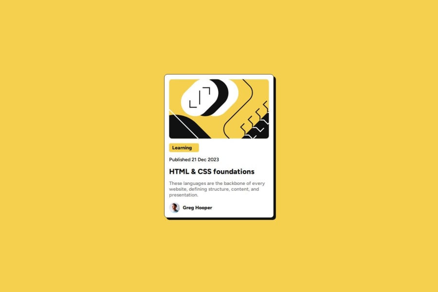
Design comparison
SolutionDesign
Community feedback
- @ovioziPosted 7 months ago
To improve: The .gitignore file shouldn’t be visible in the remote repo The html still has some accessibility unresolved warnings :
- h1 element should appear before h4
- <img> tag should be enclosed in a semantic tag (aka landmark)
Use more relative sizes instead of absolute pixels (it’s helpful for users: for ex. browser zoom can distort the image/text if px are used)
Perhaps this case @media (max-width:550px) {...} can be solved/removed by adopting a mobile 1st approach
Differences from design :
- the text needs some line-height for spacing
- the <h1> text wraps onto the next line when going under 621px & 1243px
- main text(grey) weight is too bold
Good luck!
0
Please log in to post a comment
Log in with GitHubJoin our Discord community
Join thousands of Frontend Mentor community members taking the challenges, sharing resources, helping each other, and chatting about all things front-end!
Join our Discord
