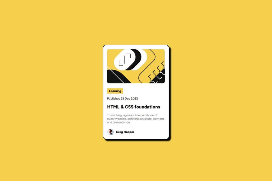
Design comparison
Solution retrospective
completing this challenge within short time is good. next time I would make media queries more efficient.
What challenges did you encounter, and how did you overcome them?everytime making a container and making it width and height is crucial. so i have to have to find a perfect solution for it.
What specific areas of your project would you like help with?to make responsive website with responsible images
Community feedback
- @dylan-dot-cPosted 4 months ago
Looking good.
I see that you were trying to make the shadow but you used border instead of
box-shadow.So you can just use that and experiment to get the shadow you need.
Marked as helpful0@NalsDevPosted 4 months ago@dylan-dot-c Thank you for your feedback. I have updated the code with box-shadow. If you have time check it out.
0@dylan-dot-cPosted 4 months ago@NalsDev Yh its good now, just make sure you change the border to 1px not 2 and take off the blur from the shadow(the last 10px could be 0) so it won't blur.
Also remember to generate a new screenshot!
Take care.
Marked as helpful0
Please log in to post a comment
Log in with GitHubJoin our Discord community
Join thousands of Frontend Mentor community members taking the challenges, sharing resources, helping each other, and chatting about all things front-end!
Join our Discord
