Submitted 11 months ago
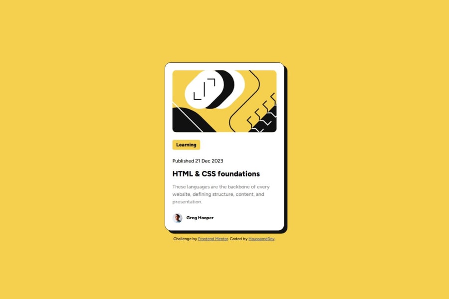
Blog Preview Card With Html & CSS - Responsive Design
#accessibility
@houssamedev
Design comparison
SolutionDesign
Solution retrospective
What are you most proud of, and what would you do differently next time?
I'm Proud that i use the default responsive behavior to my advantage ,while writing less code and i will use JS next time to update the project to be more interactive.
What challenges did you encounter, and how did you overcome them?to be able to see the project in different screen sizes and i found a good chrome extension for that : mobile simulator - responsive testing tool.
What specific areas of your project would you like help with?to write clean code and see if there a way to use less CSS for this project.
Community feedback
Please log in to post a comment
Log in with GitHubJoin our Discord community
Join thousands of Frontend Mentor community members taking the challenges, sharing resources, helping each other, and chatting about all things front-end!
Join our Discord
