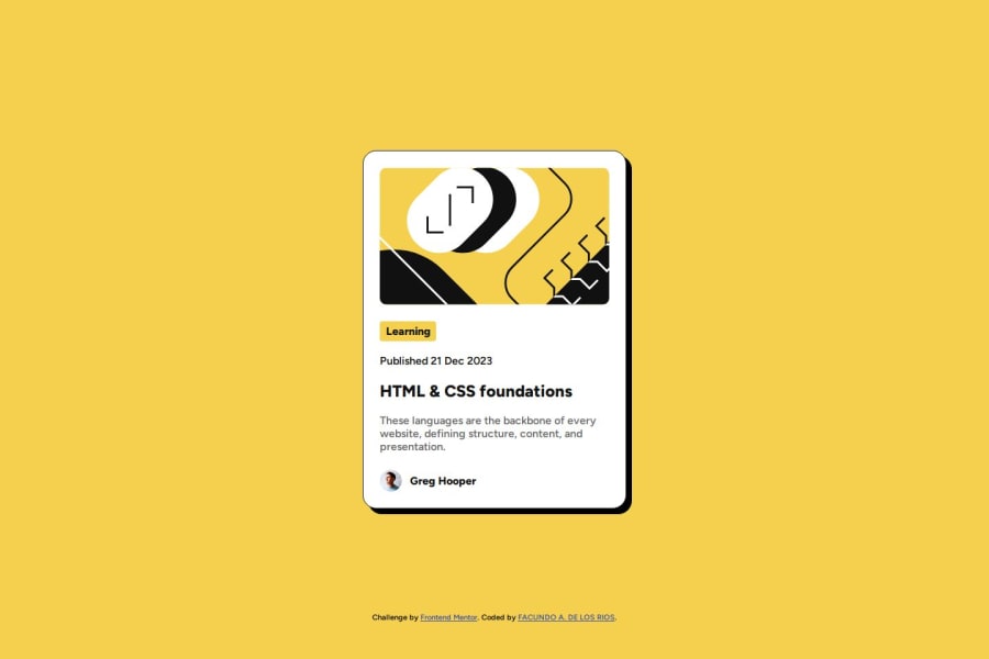
Blog preview card with HTML & CSS
Design comparison
Solution retrospective
🛸 Hello FEM Community! I'm Facundo and this is my solution for this challenge! 😊
🛠️ Built with:
- HTML 🧱
- CSS 🎨
- BEM Notation 🅱️
This project challenges us to study the interactions with the elements that we can find on a web page and I was also able to learn how to use typographic variables of fonts.
Again, thanks to the Front-End Mentor team that creates challenges that make us learn a lot from doing them. 💟
If you have any suggestions on how I can improve this project, feel free to leave me a comment!
Feedback welcome 😊
Community feedback
- @jvondungenPosted about 1 month ago
Hello @FacundoDLR! Nice job on this challenge! I'd like to point out how well you did with the following: -I really like how seamless your responsive design is.
- Also like how you used CSS variables to style the elements. -Your code is well structured and easily readable.
Some constructive feedback: -The mobile design size of 375px or less should have the "description" hidden:
@media only screen and (max-width:380px) {.description{visibility:hidden;}}Hope that's helpful to you! Thanks so much for your design. I appreciate being able to see your solution to the challenge. Cheers! Jennifer
Marked as helpful0
Please log in to post a comment
Log in with GitHubJoin our Discord community
Join thousands of Frontend Mentor community members taking the challenges, sharing resources, helping each other, and chatting about all things front-end!
Join our Discord
