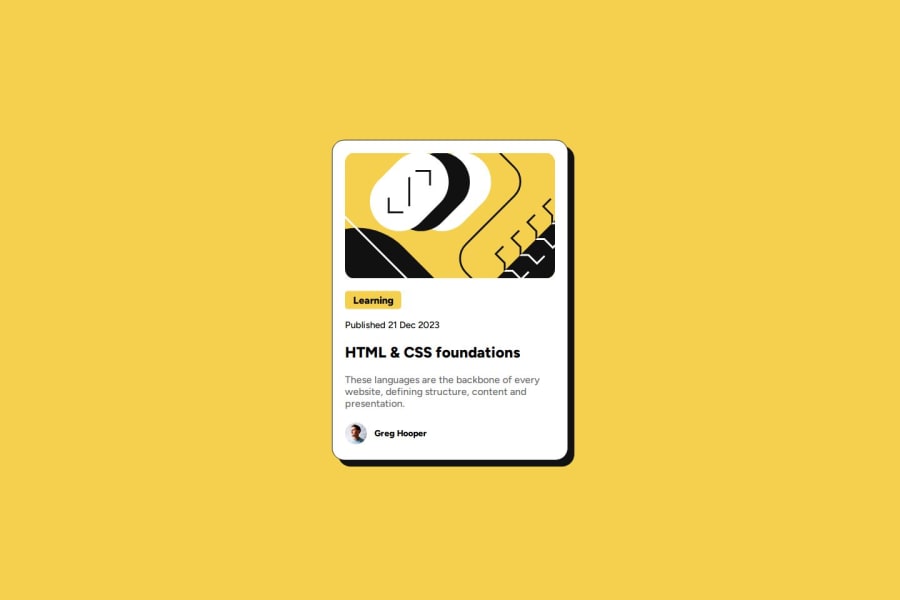
Design comparison
SolutionDesign
Solution retrospective
What are you most proud of, and what would you do differently next time?
El uso del CSS y creo que para una siguiente ocasión haría el responsive.
What challenges did you encounter, and how did you overcome them?EL CSS y lo superé intentando
What specific areas of your project would you like help with?En el responsive
Community feedback
- @coding-vasuPosted 8 months ago
Feedback
Positive
✅ Overall, the project looks nice!
Areas for Improvement
-
Interactive States
- Hover, Focus, and Active states are missing
- Refer to the Figma file for the correct implementation of these states
-
HTML Structure
- Use semantic HTML elements, particularly the
<main>tag for the primary content
- Use semantic HTML elements, particularly the
-
Accessibility
- Implement
tabIndexto improve keyboard navigation and accessibility
- Implement
-
Responsive Design
- The site is not responsive on smaller screens
- Ensure the layout adapts well to various screen sizes, especially mobile devices
0 -
Please log in to post a comment
Log in with GitHubJoin our Discord community
Join thousands of Frontend Mentor community members taking the challenges, sharing resources, helping each other, and chatting about all things front-end!
Join our Discord
