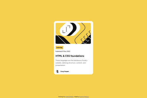
Blog Preview Card with HTML and CSS

Solution retrospective
I think I did better with positioning the elements than the previous challenge. I also use semantic HTML and use variables for colors this time! I did not accomplish reducing the font size for a smaller screen, unfortunately. I will fix this when I get a grasp of it.
What challenges did you encounter, and how did you overcome them?To reduce font size for smaller screens. I need to grasp an understanding of viewport, calc, em, and rem before I can overcome this.
What specific areas of your project would you like help with?How to reduce font size for smaller screens. It would be helpful if you could walk me through for this challenge. Also, some feedbacks on my HTML and CSS structure would be appreciated.
Please log in to post a comment
Log in with GitHubCommunity feedback
No feedback yet. Be the first to give feedback on Purnama S Rahayu's solution.
Join our Discord community
Join thousands of Frontend Mentor community members taking the challenges, sharing resources, helping each other, and chatting about all things front-end!
Join our Discord