Design comparison
SolutionDesign
Community feedback
- @Mohamedaahmed-90Posted about 1 month ago
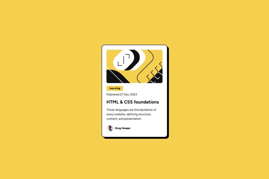
It's nice work. using flexbox is suitable to this case. you can use media query to make your design responsive with different device screens. also you can adjust width of card wrapper. also you can use variables on your code through root selector
0
Please log in to post a comment
Log in with GitHubJoin our Discord community
Join thousands of Frontend Mentor community members taking the challenges, sharing resources, helping each other, and chatting about all things front-end!
Join our Discord
