


There are a couple of really important extra learnings from this challenge.
- You've called an element a heading in the class name so you obviously recognise it is a heading. Yet you've not used a heading element! It must have one. Probably a h2 as this component wouldn't ever be a page title.
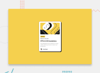
- The whole point of this component is to signpost people to a blog article. The design even shows it has a hover/focus style so must be interactive. But you've not included a link. That's essential. It should wrap the blog title, inside the heading element when you add it.
- Once the html is corrected you can add the hover and focus styles onto the link. To make the whole card clickable, you'd usually make the card position relative and give the link a pseudo element that is absolutely positioned over the whole card.
- (Recommendation) Include the reset at the start of your styles. Don't add a whole extra css file for no benefit.
- Learning ribbon text must not have a width. This needs to be a robust solution where authors could add different ribbons/tags/categories and where users can set different font styles as needed. As soon as you set a fixed width you break all that. All this text element needs is some padding.
- This is touching the sides of my screen on all sides when it shouldn't. There should be some padding on a wrapping element.
- Remove the position fixed from the footer. It's unnecessary and all it does is cause overflow bugs.
Marked as helpful
2

