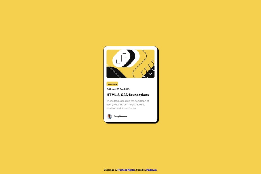
Design comparison
Solution retrospective
I have made this as my 2nd exercise on FrontendMentors. I am glad to accept any feedback and suggestions regarding the accessibility of the webpage.
I had used the :has() pesudo selector to acheive the animation when the heading is hovered. But is there any other easier ways to make this possible. Also feel free to go through my code and give suggestions.
Community feedback
- @rayaattaPosted 11 months ago
Hi Madhavan, congratulations completing this challenge 🎉 I have some tips that might probably spark your interest 1.the
<footer>tag is a land mark for a page,it acts like a better alternative to a div.this means that text inside the footer should be enclosed inside an html tag for text such as a<p>element 2.I noticed you enclosed an<h1>tag inside an<a>element in this piece of code<h1 class="card__heading">HTML & CSS foundations</h1> </a>You have to interchange this for accessibility reasons. The
<h1>should enclose the<a>. 3.it is better to include the link to your fonts inside the html file. 4.I liked that you experimented with the:has()selector.But you could have achieved the same effects with just.card:hover /*you add other selectors here to target child and descendants elements here*/ { /*Effects here*/ }Apart from that your project is awesome
Marked as helpful1
Please log in to post a comment
Log in with GitHubJoin our Discord community
Join thousands of Frontend Mentor community members taking the challenges, sharing resources, helping each other, and chatting about all things front-end!
Join our Discord
