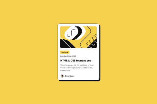
Blog preview card with 'Fluid Typography'

Solution retrospective
🔎 I find a way to reduce font size for smaller screens without using media queries. I used 'Fluid Typography' with the clamp() function that ensures that the font size stays within a specified range. This technique allows the font size to be flexible and adaptive across different screen sizes while still staying within defined limits.
✌️ I also uses a responsive layout for the card-section. In this case, the width of an element is dynamically adjusted based on the viewport width while staying within a specified range: This technique combines fixed and flexible dimensions.
What challenges did you encounter, and how did you overcome them?I wanted to find out the best way to write semantic HTML, so I looked in the mdn web docs https://developer.mozilla.org/en-US/docs/Web/HTML to find the most useful structure.
Please log in to post a comment
Log in with GitHubCommunity feedback
No feedback yet. Be the first to give feedback on Maren Ehlers's solution.
Join our Discord community
Join thousands of Frontend Mentor community members taking the challenges, sharing resources, helping each other, and chatting about all things front-end!
Join our Discord