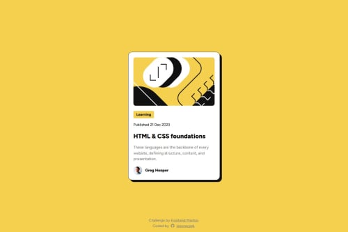
Blog Preview Card with fluid text sizes

Solution retrospective
For this project I learned a few new skills. I implemented the CSS clamp function for responsive text sizing without using media queries. I've used pseudo elements and selectors before, but in this project I learned how to properly build a hoverable card, by making sure the tag is wrapped within the heading element. This is also the first project where I hosted my fonts instead of linking the google fonts in my html head.
What challenges did you encounter, and how did you overcome them?The most difficult challenge was implementing clamp to make my text fluid between mobile and desktop views. It took lot of trial and error to achieve the results I wanted.
What specific areas of your project would you like help with?Definitely the fluid text. At this point it "works", but I would really love feedback on my code for this, because I am sure it could be improved. But also any feedback on any other areas in my code would be greatly appreciated.
Please log in to post a comment
Log in with GitHubCommunity feedback
No feedback yet. Be the first to give feedback on jasoneczek's solution.
Join our Discord community
Join thousands of Frontend Mentor community members taking the challenges, sharing resources, helping each other, and chatting about all things front-end!
Join our Discord