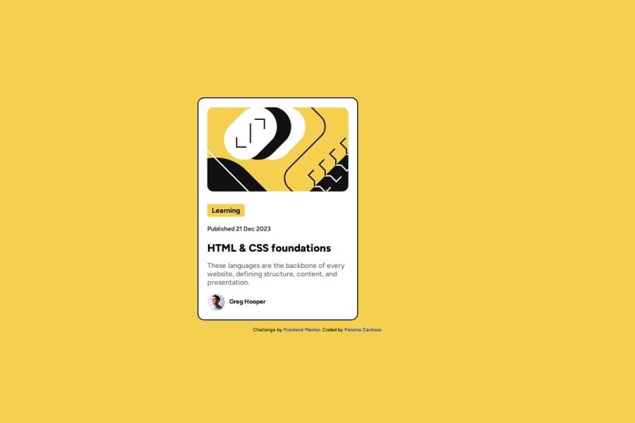
Blog Preview Card with Flexbox and Media Queries


Design comparison

Solution retrospective
I’m proud of how I managed to make the card responsive using Flexbox and Media Queries. The smooth transition with the shadow effect on hover also adds a nice touch. Next time, I’d like to experiment more with CSS animations to make the interaction even more engaging.
What challenges did you encounter, and how did you overcome them?I struggled a bit with getting the image in the card to have perfect proportions across all screen sizes. Initially, it was stretching too much or getting cut off. After using object-fit: cover, it helped maintain the image's aspect ratio while covering the entire container, which solved the issue.
What specific areas of your project would you like help with?I would appreciate feedback on my use of Flexbox for aligning elements within the card. I feel the layout is functional but am unsure if there is a more efficient or cleaner way to structure it.
Community feedback
Please log in to post a comment
Log in with GitHub
Join our Discord community
Join thousands of Frontend Mentor community members taking the challenges, sharing resources, helping each other, and chatting about all things front-end!
Join our Discord