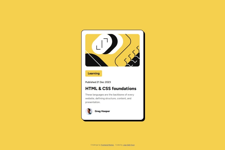
Blog preview card with flexbox and media queries


Design comparison

Solution retrospective
I enjoyed using such bold colours in the design and found including media queries an important feature although think the design could be achieved possibly without these.
What challenges did you encounter, and how did you overcome them?I'm still getting to grips with the design files so wasn't entirely sure how to apply the font style 'Figtree' directly from these so ended up importing them from google fonts.
What specific areas of your project would you like help with?If someone can explain ways to use the fonts in the design files without searching for these on Google Fonts please?
Is there another way you would have achieved this design without using media query for smaller screens?
Community feedback
- @imaragPosted 27 days ago
Generally speaking, using flex and grid you can control the layout in various screen sized. In this example howerver, there is no need, since we are just changing some font sizes etc. I really like the structure of your code. You just missed the size of the card (width and height). Overall, nice job!!
Marked as helpful0@Joan-Bell-FayePosted 27 days ago@imarag Thank you :) CSS grid gives me the fear!!! But...I'm sure I will have to get over that as I progress through the challenges! Thank you for your feedback :)
0@imaragPosted 27 days ago@Joan-Bell-Faye i would suggest this video of kevin powell to watch about the grid. It helped me a lot too!! https://www.youtube.com/watch?v=rg7Fvvl3taU
Marked as helpful0@Joan-Bell-FayePosted 26 days ago@imarag Thank you, I love Kevin Powell! I will watch this :)
0

Please log in to post a comment
Log in with GitHubJoin our Discord community
Join thousands of Frontend Mentor community members taking the challenges, sharing resources, helping each other, and chatting about all things front-end!
Join our Discord