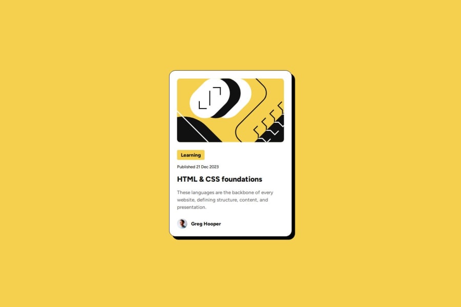
Design comparison
Solution retrospective
- proud of using flexbox
-
new font handle
-
using clamp()
-
google and chatGPT helps anytime
Community feedback
- @grace-snowPosted 5 months ago
I hope these pointers are useful:
- in my opinion the image is decorative in this so should have empty alt. The current description really isn't adding anything beneficial to the content.
- don't be afraid of using divs. That section for the card footer is only needed for layout purposes, it's not a distinct section of content.
- learning shouldn't be a link. That's just a topic/category for the blog. The design shows this whole card is clickable, so it should only have one clickable element within it.
- the link for the blog title should go inside the heading, not the other way around.
- when making a single component like this it's important to consider how it will be used in a real site. This card would never be used to serve the main heading on a page. So you know it shouldn't have a h1. Use a lower importance heading level like h2 instead.
- the alt on the author image isn't bringing any value either. I think it's fine to treat that as a decorative image as well (leave empty). If you consider it valuable content that requires a description then the description would need to describe what the image looks like not just give the person's name.
- the author name is definitely not a heading. That doesn't make sense because its not acting as heading for any subsequent content. It's just a paragraph.
Also the height 100vh and width 100vw are causing a severe bug right now. Never limit height like that. It's causing content to get cut off at some screen sizes. Use min-height if you need not height which is limited. Similarly, width 100vw is unnecessary on block elements that are already full width by default, and can only cause overflow bugs. Because traditional viewport units don't consider scroll bars or device notches, 100vw actually means "make this full width PLUS the width of any scrollbar that may be present". This makes an unwanted horizontal scrollbar appear on some screen sizes.
Marked as helpful2P@DocForLoopPosted 5 months ago@grace-snow
Hi, Thank you so much for your detailed help, I have updated the project following your advices. :)
0
Please log in to post a comment
Log in with GitHubJoin our Discord community
Join thousands of Frontend Mentor community members taking the challenges, sharing resources, helping each other, and chatting about all things front-end!
Join our Discord
