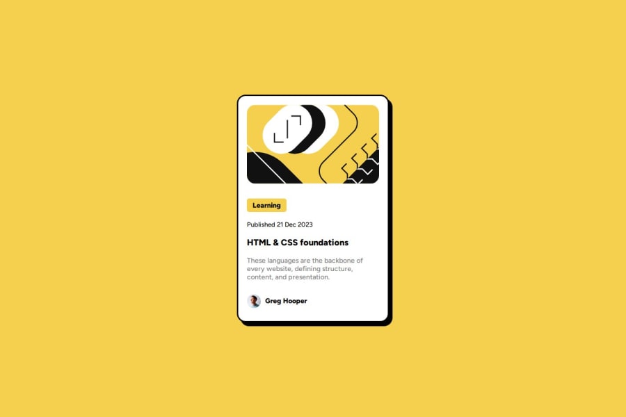
Design comparison
SolutionDesign
Community feedback
- @chrisk71Posted 9 months ago
Hi @Steven-Ang,
Your solution looks very close to the original design! As a fellow beginner you can take my feedback with a grain of salt, but I suggest using <section> for the card and then use <div> for each element you want to style in CSS.
0
Please log in to post a comment
Log in with GitHubJoin our Discord community
Join thousands of Frontend Mentor community members taking the challenges, sharing resources, helping each other, and chatting about all things front-end!
Join our Discord
