

Design comparison

Please log in to post a comment
Log in with GitHubCommunity feedback
- P@jeffgrahamcodes
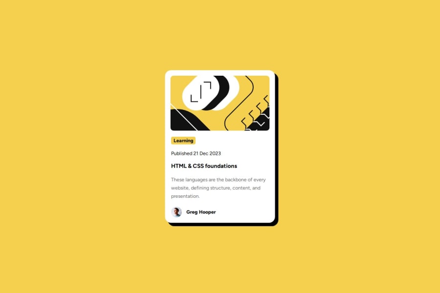
Jair117’s solution demonstrates strong attention to detail, with effective use of semantic HTML, a clean layout, and well-organized CSS. The use of
<section>and<article>tags provides clear structure, and flexbox ensures consistent alignment across different screen sizes. The design closely matches the Figma reference, with accurate spacing, colors, and typography. However, adding meaningfulalttext to images, particularly the blog image and avatar, would improve accessibility. Additionally, wrapping the blog image in a<figure>tag could enhance semantic clarity.On smaller screens, the layout generally holds up well, but refining padding and margins for ultra-narrow viewports could further improve responsiveness. In the CSS, introducing more detailed comments and maintaining consistent naming conventions for class names would make the code even more readable and scalable. Lastly, focus styles on interactive elements (
:focus-visible) could be more defined for better keyboard navigation. Overall, this is an impressive implementation with only minor adjustments needed to reach an even higher level of polish. Great work! 🚀Marked as helpful

Join our Discord community
Join thousands of Frontend Mentor community members taking the challenges, sharing resources, helping each other, and chatting about all things front-end!
Join our Discord