

Design comparison

Solution retrospective
There might be a flaw in the delivered figma file. The given spacing '200' has a size of 16px and is used for example for the cards padding. The actual layout size and the css custom property fallback are set to 24px, but still looks like this in figmas dev mode:
padding: var(--spacing-200, 24px);
So I ignored the overall layout size and stayed with the given design system with a padding of 16px. If you want to have a padding of 24px, please rebuild the challenged figma file with --spacing-300: 24px
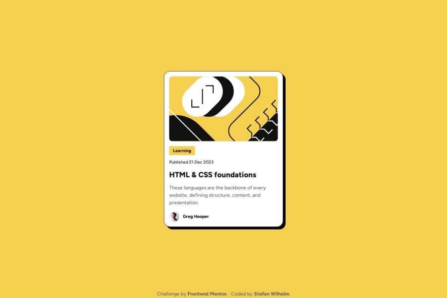
Mobile: I also ignored the image been cut on the edges. In a real world, I would consider to take a picture element with a second image on mobile.
But on this, being a challenge I would consider myself to have failed.
What specific areas of your project would you like help with?I should take a look at other solutions regarding the cut image on mobile

Join our Discord community
Join thousands of Frontend Mentor community members taking the challenges, sharing resources, helping each other, and chatting about all things front-end!
Join our Discord