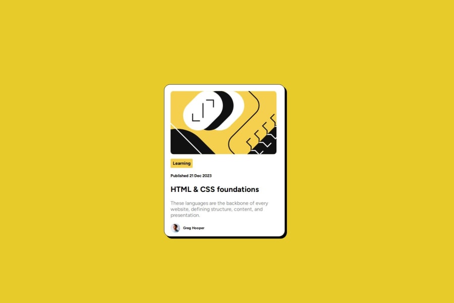


Design comparison

Solution retrospective
I'm really glad that I think I've been able to reproduce the design satisfactorily. I wanted to be creating using CSS grid as I expect to be doing that in the future against Figma templates, and so I'm really glad that I could get practice doing this even if I haven't achieved the perfect solution. I'm feeling more confident in working with CSS grid and also how to be working towards good responsiveness between different devices.
Next time I would probably focus earlier on getting the correct layout and responsiveness before going in to depth with styling, to ensure that it is all functioning correctly first. I think this would also be considered a better workflow.
What challenges did you encounter, and how did you overcome them?I had difficulties working between the CSS grid and getting the correct responsiveness for different devices sizes. I had trouble in understanding how to best have the card keep the correct shape and keep it within its bounds correctly on the grid when changing to suit the screen. With this, not letting content spill out of the card but style them correctly and have them become smaller instead as the card shrinks. I found and read some articles online and kept experimenting with the media queries and browser tools, until I think I managed to have a satisfactory solution and it appeared to be working correctly.
I also had a bit of difficulty with the layout of elements inside the card - particularly with the avatar's spacing at the bottom. I set some fixed heights for smaller screens to prevent the large spacing, and corrected the size of some gaps for the content to be spaced adequately in the desktop view.
What specific areas of your project would you like help with?I would really like to know whether I have correctly applied responsive behaviour to the card in the best way, and what should have been done differently to the card's elements to make it more naturally responsive. I'm not sure I should have been manually setting the card max-height for smaller screens.
Also have I correctly created the component restricting it to the modules that it occupies and not letting it grow to the size of the content? I had some trouble getting the spacing around the avatar at the bottom in the desktop view.
Community feedback
Please log in to post a comment
Log in with GitHub
Join our Discord community
Join thousands of Frontend Mentor community members taking the challenges, sharing resources, helping each other, and chatting about all things front-end!
Join our Discord