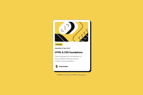
Blog preview card with CSS grid layout
Design comparison
Solution retrospective
Hello everyone, this is my solution to the Blog preview card challenge that used CSS grid layout. I had difficulty placing the image with background-image, as the image did not appear even though I placed a fixed size of the div. Therefore, I chose to use the img tag. I would be grateful if you could give feedback. šš
Community feedback
- @danielmrz-devPosted 12 months ago
Hello @AntonielAureliano!
Your solution looks excelent!
I have just one suggestion:
- In order to make your HTML code more semantic, don't skip heading levels - start with
<h1>
, then use<h2>
, and so on. Unlike what most people think, it's not just about the size and weight of the text.
š The
<h1>
to<h6>
tags are used to define HTML headings.š
<h1>
defines the most important heading.š
<h6>
defines the least important heading.š Only use one
<h1>
per page - this should represent the main heading/title for the whole page.This change has little or not effect at all on the project, but it makes your HTML code more semantic, improving SEO optimization as well as the accessibility of your project.
I hope it helps!
Other than that, you did a great job!
Marked as helpful0@AntonielAurelianoPosted 12 months ago@danielmrz-dev Thanks for the sugestion. I will take it into consideration in my next projects. š
0 - In order to make your HTML code more semantic, don't skip heading levels - start with
Please log in to post a comment
Log in with GitHubJoin our Discord community
Join thousands of Frontend Mentor community members taking the challenges, sharing resources, helping each other, and chatting about all things front-end!
Join our Discord