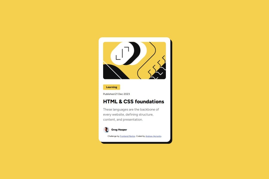
Blog Preview Card with CSS Flexbox


Design comparison

Solution retrospective
Flexbox is amazing tools that helps arranges an item inside the container.
What challenges did you encounter, and how did you overcome them?To side by side an item inside container. using with flexbox
What specific areas of your project would you like help with?For responsive font , need more explanation using css function
.title-blog {
  ....
  font-size: clamp(24px, 2.5vw, 28px);
  ....
}
Community feedback
- @lenz-moragaPosted 4 months ago
The Section tag represents a generic standalone section of the page, it can be a part of the page unrelated to the other content. But in your solution, you are using it several times inside the article element that works as a wrapper.
Also, you added the header and footer tag inside the article, which most of the time, is used to mark the initial and last section of the whole page, not just the beginning and the end of a section, an option to these tags of how you want to implement it is doing this
<div role="header">This is the header</div>
<div role="footer">This is the footer</div>
to keep consistency, and reduce noise in the comparison with the desired design, I would move the attribution part to the bottom of the page, instead of at the bottom of the card.
according to the design, all the texts should have a line height of 150%, but the title is 125%.
you missed the border and checking your solution I noticed that the border radius of my solution was wrong so thanks, gonna fix that xD
most of the time, as a frontend, you will want to match the design almost above 80%, you nailed that but keep an eye on the sizes of the elements, the text doesn't break at the same words as the design.
you mentioned that you used Flexbox, you could use that to reduce the use of the margins in the elements inside the article and start using the gap property.
regarding the clamp functionality you asked for, it is used to set a minimal size, a preferred one, and a maximum size, like this
clamp(min, val, max)where
- min is the smallest (most negative) value. This is the lower bound in the range of allowed values.
- val is the preferred value is the expression whose value will be used as long as the result is between the minimum and maximum values.
- max is the maximum value is the largest (most positive) expression value to which the value of the property will be assigned if the preferred value is greater than this upper bound.
here is a more detailed explanation
you can also use calculated values, but you will get to that eventually :D
here is my solution in case you want to take a look happy coding!
Marked as helpful1

Please log in to post a comment
Log in with GitHub
Join our Discord community
Join thousands of Frontend Mentor community members taking the challenges, sharing resources, helping each other, and chatting about all things front-end!
Join our Discord